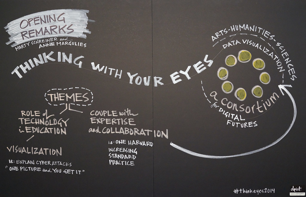
A Photoessay · Knafel Center at Radcliffe Institute, Harvard University

Thinking With
Your Eyes

Inside a symposium where data became something you could see, touch, and walk around.

For two bright, February days, scientists, librarians, artists, and designers filled a century-old hall to argue for a simple idea: that seeing is a form of thinking. Between keynotes on visualizing the cosmos and hands-on encounters with augmented-reality sandboxes, an ever-growing mural of chalk and marker recorded the conversation in real time. What follows is a walk through those days, from the greeting desk to the last panel, told in photographs.

Begin the story ↓

Chapter 01

Arrival

The day begins with name tags, string, and sticky notes. Before a single chart is shown, attendees are already sketching.
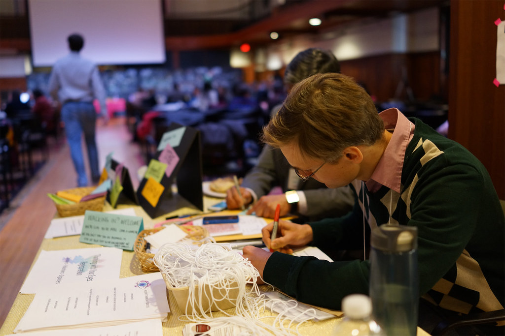
Volunteers at the greeting desk threading name-tag lanyards beside baskets of sticky notes, with the symposium hall filling behind them.
At the greeting desk, volunteers thread lanyards by hand while the hall fills — the first dataset of the day is the guest list itself.
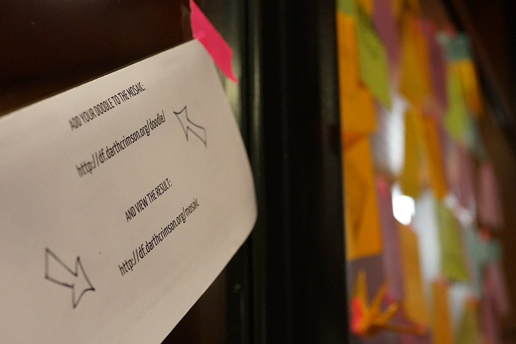
A table stocked with markers and paper at the doodle center, inviting attendees to sketch their ideas.
The doodle center: an open invitation to think on paper before thinking out loud,drafting thematic doodles that captured ideas and information as they flowed throughout the day.
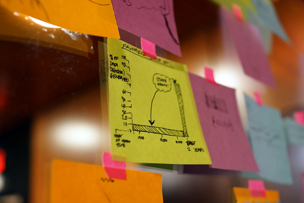
Sticky notes on a board where attendees wrote down their favorite data sets.
An icebreaker in sticky notes: “What’s your favorite data set?” The answers ranged from census records to whale songs.
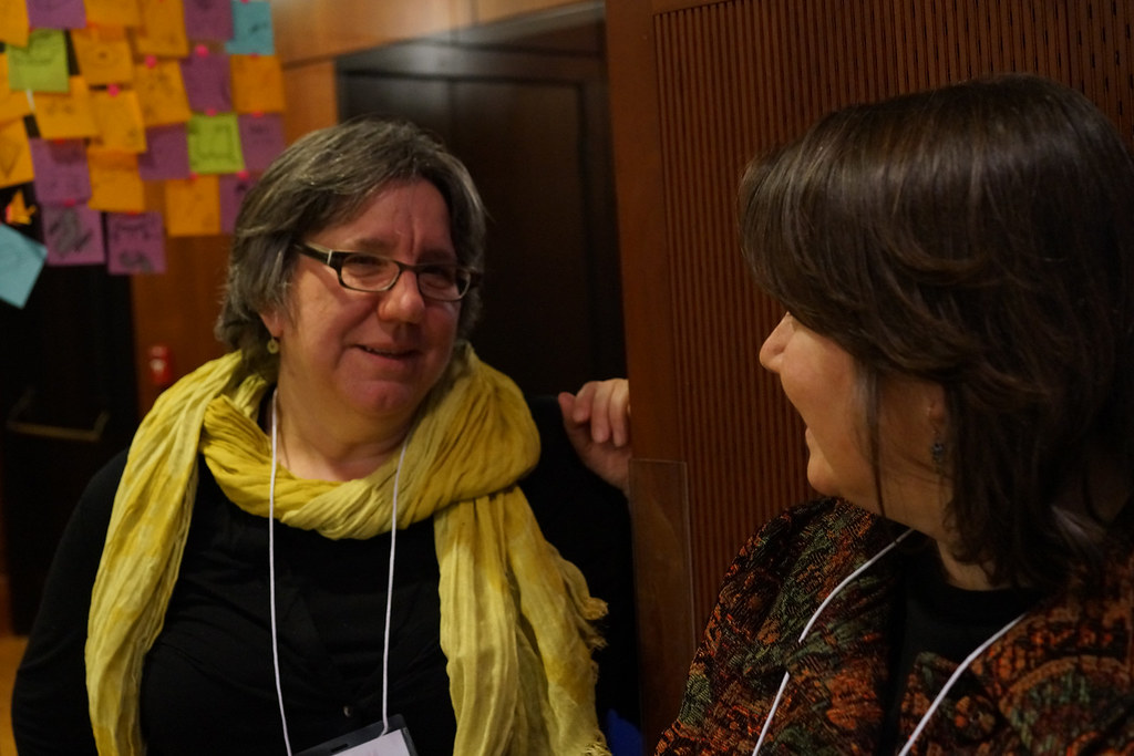
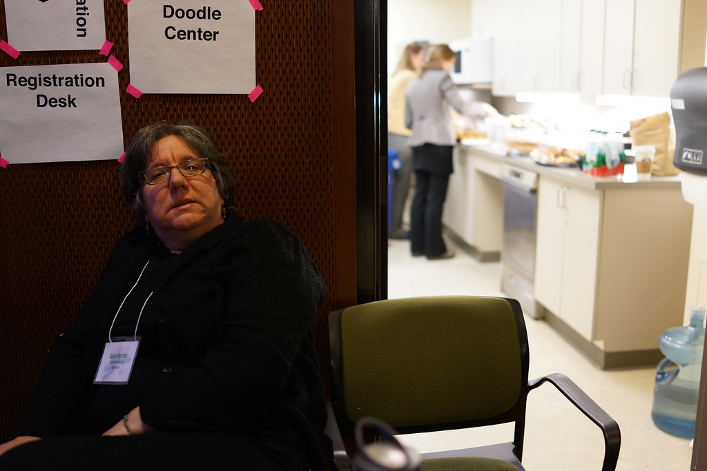
Two attendees, both named Susan, laughing as they compare notes between sessions.
Two Susans, one conversation — hallway collisions like this were half the point of the day.

“One picture and you get it.”

— from the opening remarks

Chapter 02

Voices

From the surface of Mars to the shelves of the library, the speakers shared one conviction: visualization is not decoration — it is argument.
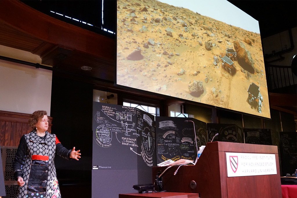
Astronomer Alyssa Goodman speaks beneath a giant projection of the Martian surface with rovers, flanked by hand-drawn graphic-recording panels.
Alyssa Goodman demonstrates navigating a two-dimensional space using three-dimensional gestures. The technique shown here incorporates a Kinect camera from an Xbox One videogame system to capture hand, arm, and body movements and translate them to image navigation commands in real-time. By putting the audience in the room on Mars that day, her argument was clear: exploration has always been a visual act.
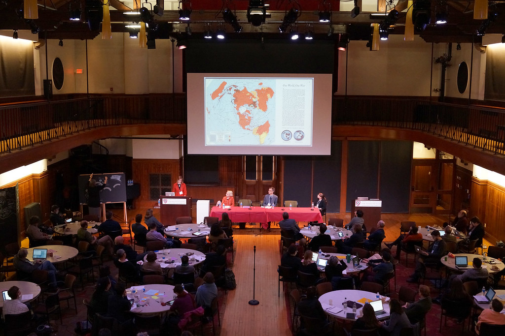
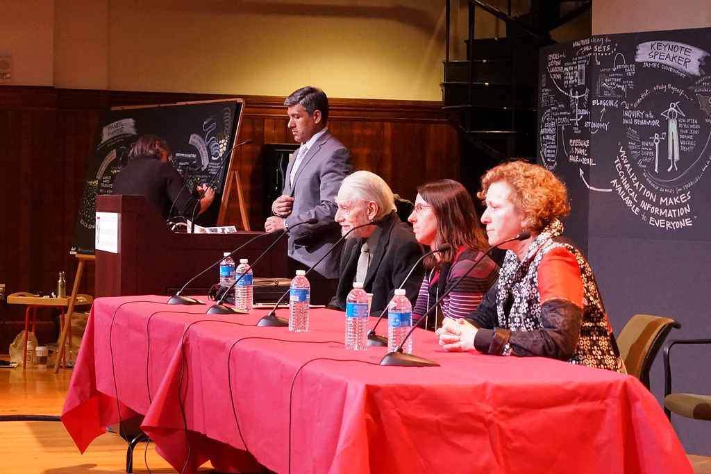
Four panelists seated at a long red-draped table on stage, framed by chalk-drawn graphic recordings of earlier sessions.
The afternoon panel convenes in front of its own visual record — the morning’s ideas, already drawn.
Professor Peter Bol gestures mid-talk while presenting on mapping historical data.
Peter Bol, the Charles H. Carswell Professor of East Asian Languages and Civilizations, makes the case for maps as time machines — centuries of history, one layer at a time.
Art historian Jennifer Roberts speaking at the podium about the discipline of slow looking.
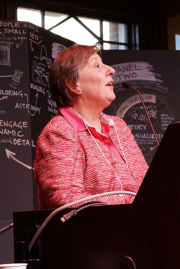
Jennifer Roberts, Elizabeth Cary Agassiz Professor of the Humanities, Harvard College Professor, and Chair of the Program in American Studies, asks the room to slow down: attention, she argues, is a skill you can teach.
Sarah Thomas of the Harvard Library addresses the symposium from the stage.
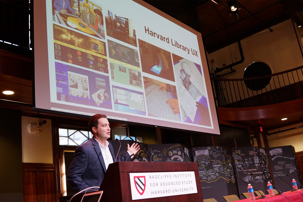
Sarah Thomas, vice president of the Harvard Library, on what libraries become when their collections turn into data.
Bonnie Burns presenting on geospatial visualization to the audience.
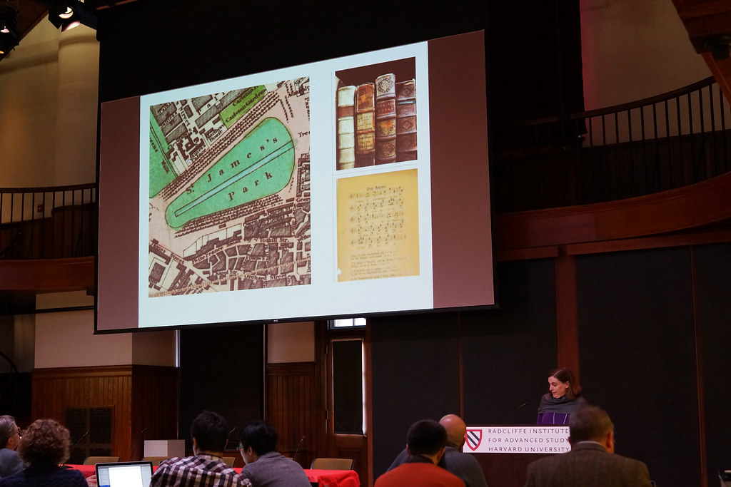
Bonnie Burns, Head of Geospatial Resources for the Harvard Map Collection, walks the room through the craft of putting data on a map — and the traps waiting there.
Christopher Erdmann speaking about data services for astronomy researchers.
Christopher Erdmann, Head Librarian, Wolbach Library, Harvard Smithsonian Center for Astrophysics, on the plumbing behind the pictures: the data services that make visualization possible.

“Visualization makes technical information available to everyone.”

— noted on the keynote wall

Chapter 03

Hands-On

Upstairs, the demos: data you could reshape with your palms, wear on your face, or pick up off the table.
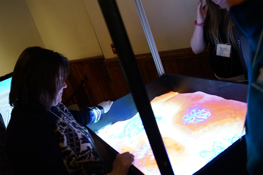
An attendee shapes real sand in an augmented-reality sandbox while a projector paints glowing elevation colors onto the terrain.
The augmented-reality sandbox: push the sand and the topography repaints itself in light. The most contested five square feet of the symposium.
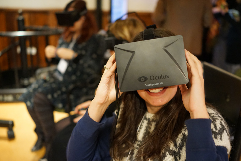
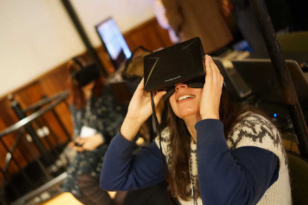
A smiling attendee holds a virtual-reality headset to her face while others wait their turn behind her.
First contact with a VR headset — the grin is universal, and so is the line forming behind her.
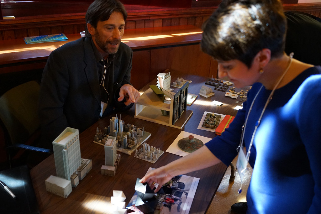
Two attendees lean over a table of 3D-printed architectural and city models, examining a miniature skyline.
A skyline you can hold: 3D-printed models turn urban data into something you inspect from every angle.
A demo host smiles while showing off 3D-printed data objects at the exhibition table.
Every demo table came with an evangelist — 3D printing, served with a smile.
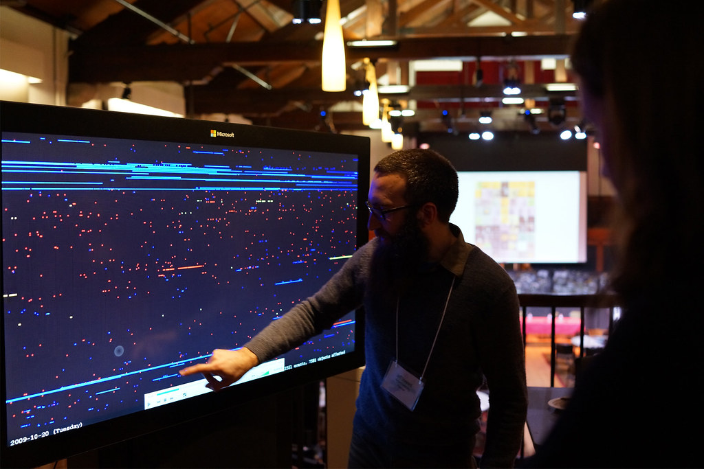
A screen-based interactive visualization of the Harvard Arboretum's living collections.
The Arboretum as database: Krystelle Denis, student at the Harvard Graduate School of Design, points out the patterns among decades of living collections, browsable in a few taps.
An interactive display visualizing the Harvard Art Museums collection data.
Thousands of artworks compressed into a single visualization and interface at the Harvard Art Museums table.

Chapter 04

The Wall

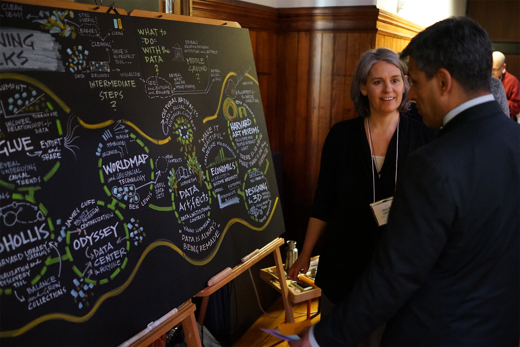
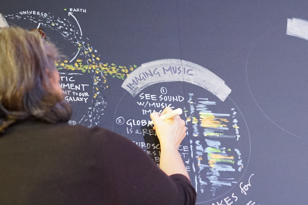
All day, graphic recorder Kelvy Bird translated every talk into chalk and marker. By evening the room had produced its own visualization: a mural of everything said.
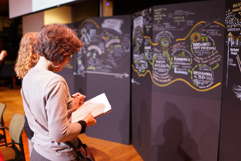
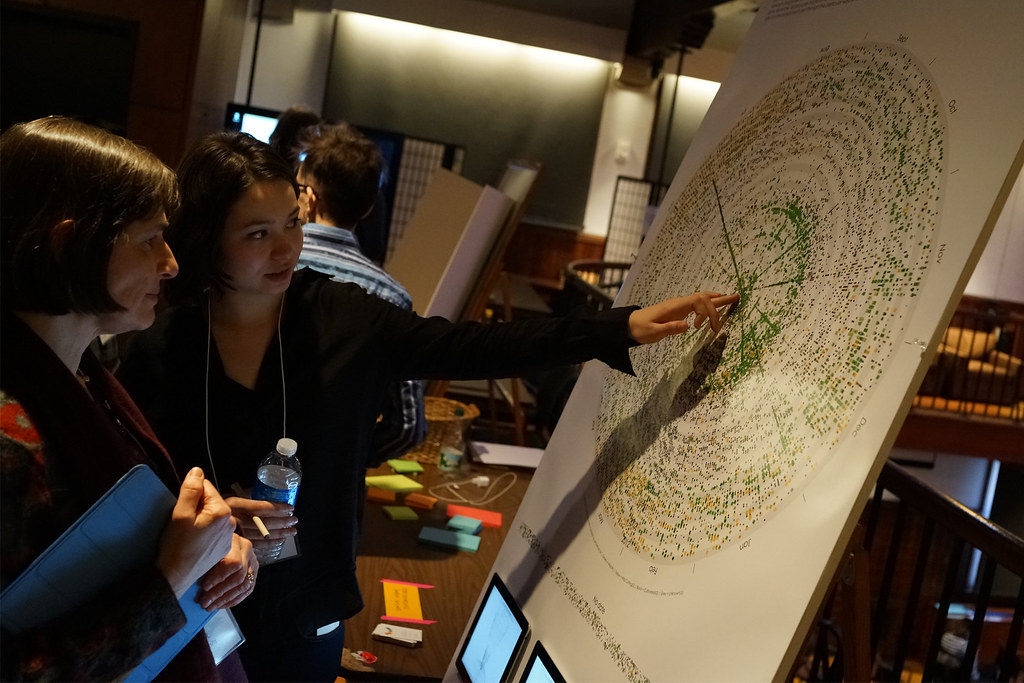
Two attendees stand close to tall black panels covered in hand-drawn graphic recordings, one taking notes on a pad.
Reading the wall: attendees mine the hand-drawn record of the morning, notebook in hand.
Graphic recorder Kelvy Bird drawing live on a large black panel during a session.
Kelvy Bird listens with a marker — distilling an hour of talk into a single drawn page, live.
Graphic recorders Kelvy Bird and Pepe Lopez working side by side on adjacent panels.
Bird and Lopez contemplate the continuous visual transcript.
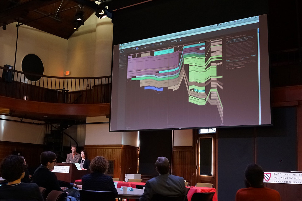
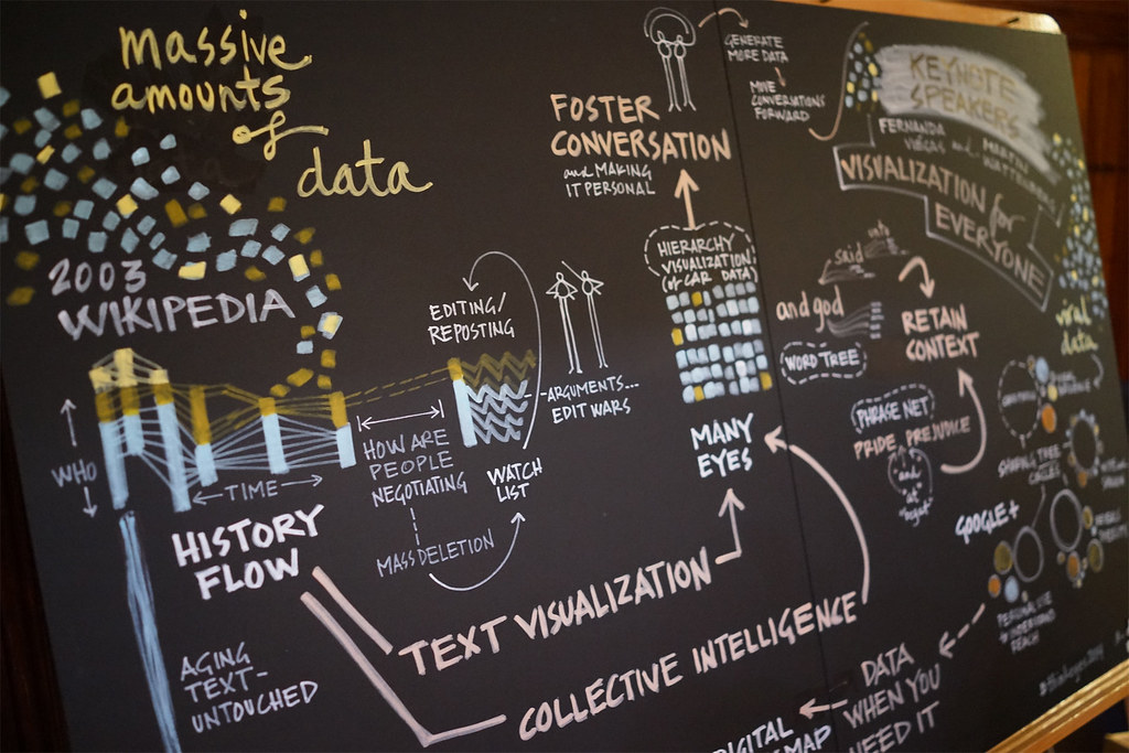
A chalk-drawn panel explaining the History Flow visualization of Wikipedia edits.
The battle report of Wikipedia’s edit wars: Fernanda Viégas and Martin Wattenberg, leads at Google's "Big Picture" visualization research group, demonstrate an early visualization project called History Flow, which mapped the history of edits to Wikipedia article entries.
A detailed chalk panel recapping the keynote on visualization for everyone, covered in diagrams and lettering.
“Visualization for everyone” — the keynote, compressed to one dense, luminous panel.
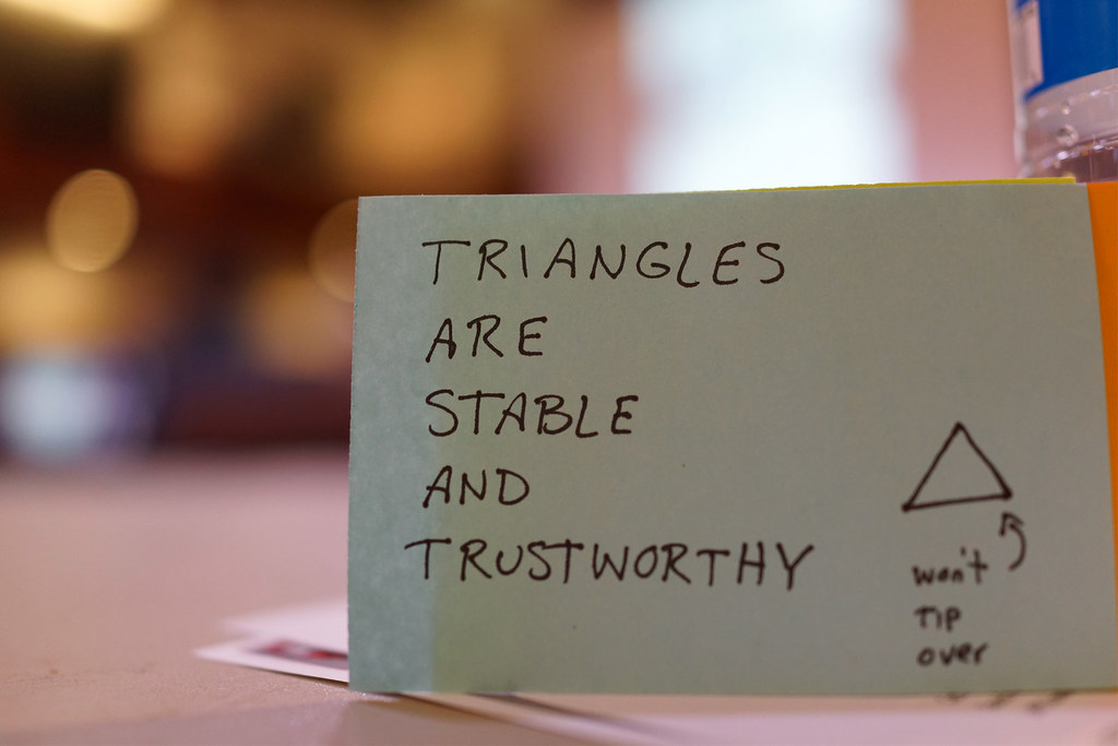
A handwritten sticky note reading 'Triangles are stable and trustworthy' with a small triangle sketch labeled 'won't tip over'.
Found on a table at day’s end: “Triangles are stable and trustworthy.” The symposium, in one sticky note.
Attendees pause for coffee and conversation during a short break between sessions.
A quick break — the last coffee before the closing panel, and nobody stops talking about charts.